The back button rule: what actually keeps a 30-screen app looking like one app
MedSync is past thirty screens now, built across months of sessions that are sometimes days apart and never in the same mood. If you'd shown me the dashboard, the medication screen, and the consultations screen on day one and asked whether the same process built all three, I'd have assumed that took a human checking every screen against every other screen before it shipped. It didn't. What it actually took was closer to a document the AI is required to read before touching anything — and being unreasonably strict about what's allowed to go in it.
Color tokens are the part that takes no discipline at all
Every color in MedSync — the primary blue, the error red, the amber warning tone, every background and border — lives in one file, constants/theme.ts, referenced everywhere by name instead of by hex code. I won't spend long on this part, because it barely deserves credit: any AI coding assistant will reuse Colors.primary once you've told it that's the rule, and it's the difference between one consistent blue and forty near-identical shades of it scattered across a year of sessions.
What color tokens don't solve is the harder version of the same problem. Two screens can use the exact identical blue and still completely disagree about where a back button sits, what a bottom sheet's corners look like, or how a tab bar shows which tab is active. Matching colors is table stakes. Matching structure is what actually makes an app feel like one product instead of thirty separate ones stitched together.
Rules written as the finished answer, not a suggestion
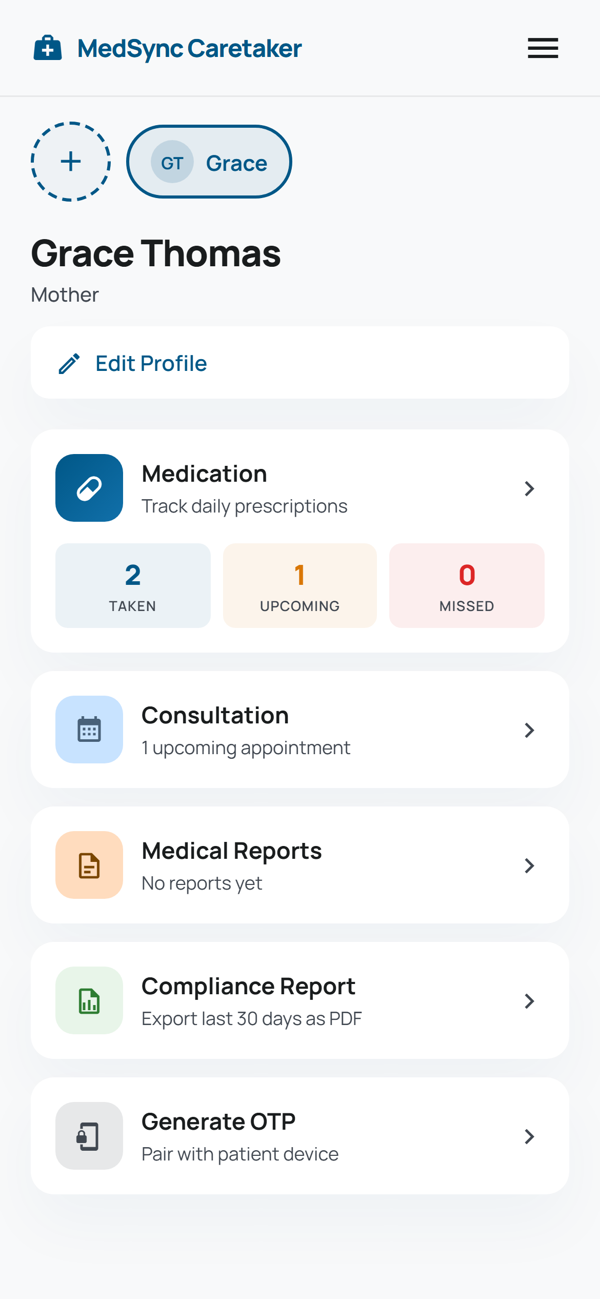
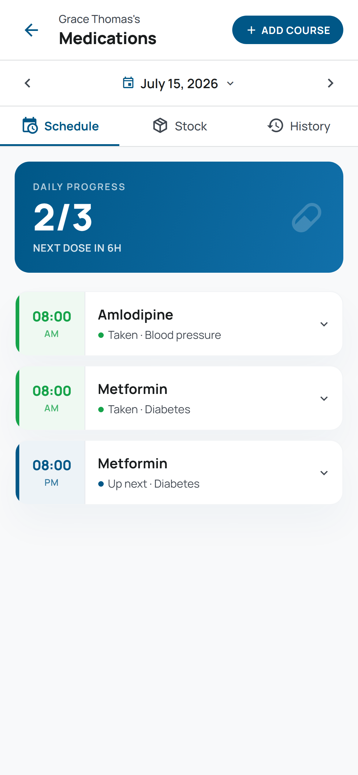
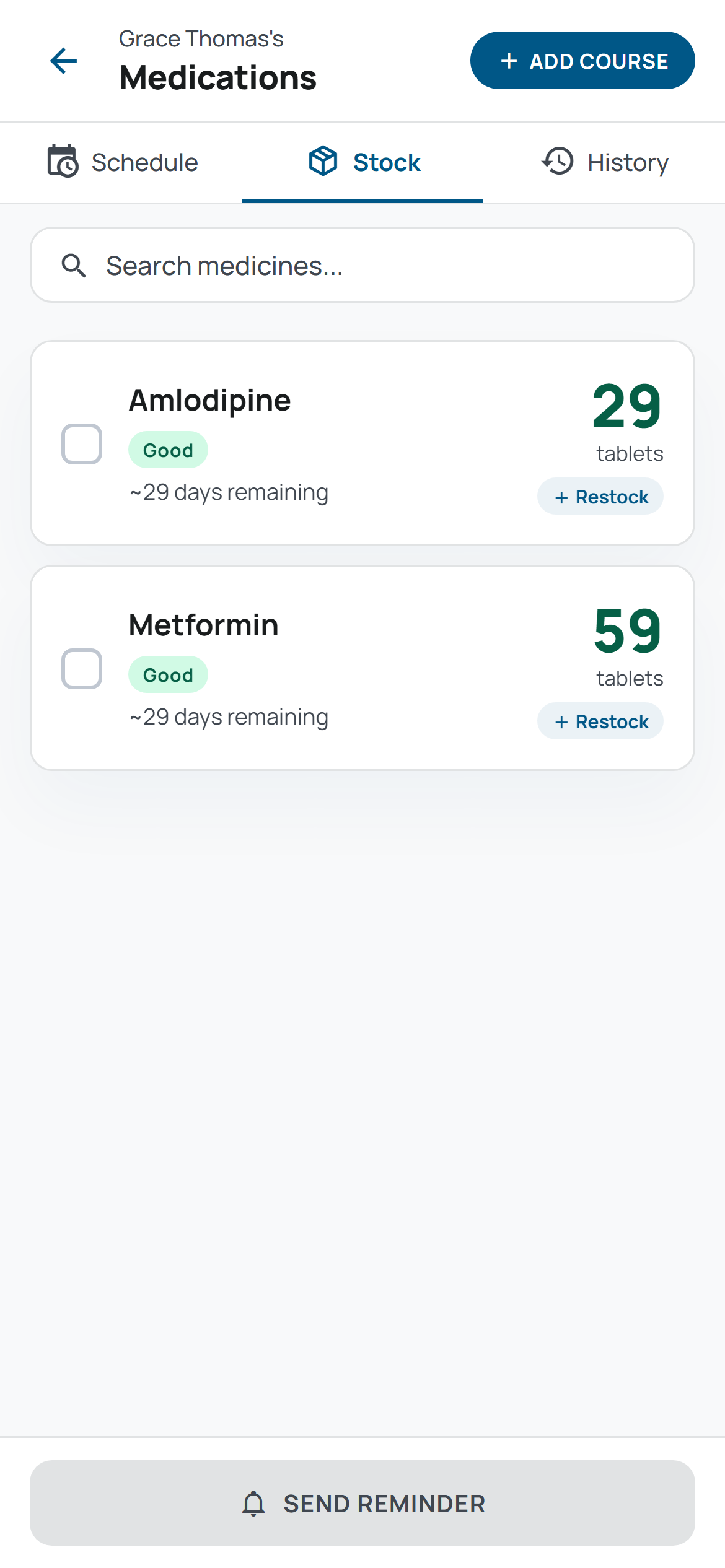
The thing that actually keeps thirty-plus screens looking like one app is a section of the project notes I think of as load-bearing: component rules written not as guidance but as the literal, finished answer, ready to be copied straight into a new file. Compare the two screenshots on this post. The tab bar on the medication screen — Schedule, Stock, History, underlined in blue — and the tab bar on the consultations screen — Appointments, History — were built in different sessions, weeks apart, for two completely different features. They're pixel-identical anyway: same underline thickness, same padding, same inactive-tab color. So is the "SCHEDULE" button next to one and the "ADD COURSE" button next to the other — same solid pill, same all-caps label, same icon size, same letter spacing, down to the number.
None of that is a coincidence and none of it is the AI "remembering" a decision from a previous session, because it doesn't remember anything between sessions. It's that the notes don't say "keep buttons consistent" — they specify the exact gradient, the exact height range, the exact corner radius, and then list, by name, every screen that's supposed to have one. That last part matters as much as the spec itself: I can scan the list and immediately notice a screen that's missing from it, rather than discovering the mismatch by accident three months later.
If I had to compress the whole idea into one sentence: a rule an AI can actually follow without supervision is one where the answer can be copied in directly. The moment a rule needs interpreting, a new session interprets it fresh, and "fresh" is exactly how you end up with forty slightly different buttons.
The rule that exists because of one specific bug
Design consistency turned out to be the easier half of this. The harder half is a running list of mistakes that have already cost a debugging session, kept specifically so the same mistake doesn't get rebuilt from scratch by a future session with no memory of the first one.
The clearest example is a screen that isn't a bottom sheet anymore, and has a comment in the project notes explaining exactly why. Doctor Form started life the way most of MedSync's forms do — a bottom sheet Modal sliding up over whatever screen opened it. It has a specialty picker, and that picker opens its own Modal for search and selection. On Android, that combination silently broke: the OS stacks Modals in the order they appear in the component tree, and a picker Modal opened from inside an already-open bottom sheet Modal rendered behind it — visible in the view hierarchy, completely untappable on screen. It worked perfectly in every check I ran that didn't involve actually opening the picker on an Android device, which is a specific enough condition that it's easy to see how a first pass would ship without catching it.
The fix wasn't a CSS tweak. It was turning Doctor Form into a real, full Expo Router screen instead of a Modal — which sidesteps Android's Modal-stacking behavior entirely, because there's no longer a Modal-inside-a-Modal for it to stack. That's a bigger structural decision than the bug looks like it deserves, which is exactly why it's the kind of fix that's easy to quietly undo later. So the rule isn't filed away as "remember the Android bug" — it's written as an instruction pointed at the future: never put a form containing a picker like this inside a bottom sheet Modal, full stop, and here is the specific screen that had to be rebuilt as a real page because of it. A future session doesn't need to have felt the bug to avoid repeating it. It just needs to read the rule before it reaches for a Modal.
What a session actually looks like now
In practice, the AI reads the project notes before I describe what I want — the stack, the exact component answers, the list of scars — before a single line of the actual request. I don't specify what a new picker or button should look like in my prompt, because the notes already answer that for anything that's a variant of something that exists. And at the end of a session, the notes get updated: not just what got built, but what almost went wrong and why, so the lesson outlives the session that learned it.
The uncomfortable part is that this front-loads effort that feels unnecessary in the moment — writing three sentences about a rendering bug on Android instead of a one-line note to move on. It pays off later, quietly: session thirty-one doesn't rebuild Doctor Form as a bottom sheet, not because anything remembers doing it wrong before, but because the mistake and its fix are sitting in the one file every session has to read first.
Next: a bug that passed every single test I ran on my own phone, and was wrong for the first patient in a different timezone the very first time it mattered.
More in this series

Why I built MedSync — and why it's a website, not an app
My mom asked if she'd already taken her medicine that day. I didn't know — and Google Play almost stopped me from fixing that.
The patient who never signs in: how MedSync shares a live schedule with someone who has no account
The person taking the medication was never going to manage a password. Here's what replaced the login screen instead.
The medication that showed up a day late — but only for patients in the wrong timezone
It passed every test I ran myself, and was wrong for anyone testing it at the wrong hour, in the wrong timezone.
What building two other apps first taught me before I started MedSync
Two finished apps bought me proven patterns. They didn't buy me a pass on double-checking the one number that actually mattered.